Earlier this year I published a post about Businessweek's ridiculous attempt at ranking colleges based on the return on investment students earn from attending the institution. I listed the problems with Businessweek's methodology, many of which were based on its decision to use data on salaries from a firm called PayScale, which invites people to complete an on-line survey and post information about what college they attended, their major, what they earn, etc. Beyond the obvious problems with data like these being collected non-randomly, using data like this to come up with a single measure for the return on investment of a college education makes absolutely no sense at all. If you don't want to read my entire post, here's the key part of my conclusion:
Most of the evidence from labor economists (see the work of Card and Krueger, or Ehrenberg) points to the fact that differences in returns to college are driven more by within college variation (i.e., differences in the choice of majors or academic experiences once enrolled in a particular college) rather than differences between colleges. What this means is that the decisions students make about what to major in, what courses to take, and what other experiences they have in college have much more influence on their post-college earnings than does the choice of which college to attend.And now another website, called CollegeMeasures.org (sponsored by the American Institutes for Research), is using the same PayScale data to come up with ratios of student loan payments to earnings for individual colleges. CollegeMeasures has a very good intent - to try to provide institutional officials and policymakers with more information about the outcomes related to higher education. The website's stated purpose is:
. . . to provide measures of performance for four-year colleges to the trustees and state government officials who are responsible for their success. Our goal is to present measures that are informative and thought-provoking, using the best data available. The data are collected from widely-respected sources and represent the best of what is available at the current time.It repeats information available from many other on-line sources on things like first-year retention rates and graduation rates. It also calculates some other measures from publicly-available data, including a cost to produce each undergraduate degree and an annual cost per student. And it then ranks each institution compared to all institutions, as well as all institutions in its own sector (public, private not-for-profit, or for-profit).
I want to reiterate that the CollegeMeasures website has good intentions. But its attempt at calculating ratios of student loan payments to earnings is, I am afraid, likely to be of little if any value to policymakers, institutional leaders, or even consumers. There are plenty of caveats about the data used in the fine print of the website, but I doubt most readers will get that far. The basic issue is that coming up with just one measure for this ratio requires the use of average (or median) student loan and earnings data. And the problem is that both of these measures are likely to have very broad distributions on any one campus, thus making a single measure - used to compare across all institutions in the country - of little or no value at best, and entirely misleading, at worst.
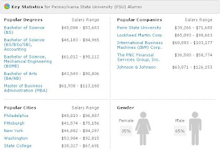
Let me use my own institution, Penn State's University Park campus as an example. You can see PayScale's salary data for the campus on its website. Here's an excerpt (you can click on an image to enlarge it):
It's unclear from the PayScale website whether these are the only salary data they have on Penn State graduates, or whether this is just a sample. And similarly, you can't tell from the CollegeMeasures website which PayScale data they use in calculating their loan repayment ratios, other than they say they are using median salary for people with five or less years of experience. But look at the salary ranges shown in the graphic above -- they are huge. In some cases, the student loan repayment ratios for students at the top end of the salary range would be less than half that of students whose salaries are in the bottom end of the distribution. So which one is the "best" repayment ratio on which to base a decision to attend Penn State or on which to judge Penn State's performance? We have no way of knowing.
There are obviously large problems with the non-random sample nature of the PayScale salary data. For example, you cannot tell who's completed their survey, and how representative they are of all Penn State's graduates. Another problem can be clearly seen in the graphic above, which shows that 65 percent of the PayScale data come from men, and 35 percent from women. But according to data from the U.S. Department of Education's IPEDS Data Center, 46 percent of bachelor's degree recipients at Penn State's University Park campus in the 2008-09 year were women. Given that men and women are non-randomly distributed across different majors, and that the earnings of men and women are quite different, the PayScale data for Penn State are clearly biased toward men.
Clearly, coming up with good measures of the return-on-investment of attending college is a difficult task. There are too many individual variables that affect the calculation, and attempts to simplify the process by coming up with a single measure - and then using that to compare across institutions - do not help us understand anything about institutional performance.


